
SugarPost — Brand Concept Spotlight
Freshly posted. Sweetly delivered.
SugarPost is a playful, postal-inspired cookie subscription concept created to celebrate the joy of receiving something sweet in the mail. Rooted in nostalgia and elevated with bold color, charming illustration, and vintage postage motifs, SugarPost turns a simple treat into a monthly moment of delight. This fictional brand explores how thoughtful, theme-driven identity design can transform a food subscription service into an experience guests look forward to long before the box arrives.

The Concept
SugarPost imagines a cookie subscription service where every delivery feels like a handwritten letter from a friend — except this note arrives with freshly baked cookies. Each monthly shipment features a curated selection of favorite flavors and a new seasonal addition, packaged in bright, cheerful designs inspired by postage stamps and mailed treasures.
The concept leans into the warm nostalgia of snail mail: perforated stamp edges, sweet little seals, mailing-label stripes, and bright, candy-colored envelopes. It’s a brand built around anticipation, joy, and the simple magic of receiving something personal in the mail.

The Brand Direction
Color Palette
SugarPost uses a bright, upbeat palette that feels instantly happy:
bubblegum pink
mint green
cookie-dough brown
sprinkle pastels
postage-stamp green
These colors make the brand feel giftable, fun, and immediately recognizable.
Typography
Bold, modern block lettering gives the logo presence — simple, friendly, and easy to spot on packaging. The cookie “O” is the signature moment, adding personality without sacrificing clarity. It’s a brand element that works seamlessly across digital, packaging, and social media.
Illustration & Motifs
Illustration drives the story. Your visuals incorporate:
postage-stamp frames
cookie illustrations with texture and bite marks
repeatable cookie patterns
“25¢” inspired postal marks
striped mailing-label textures
These motifs make SugarPost unmistakably thematic, whimsical, and cohesive — and they give the brand a system that can evolve month after month.


Brand Applications
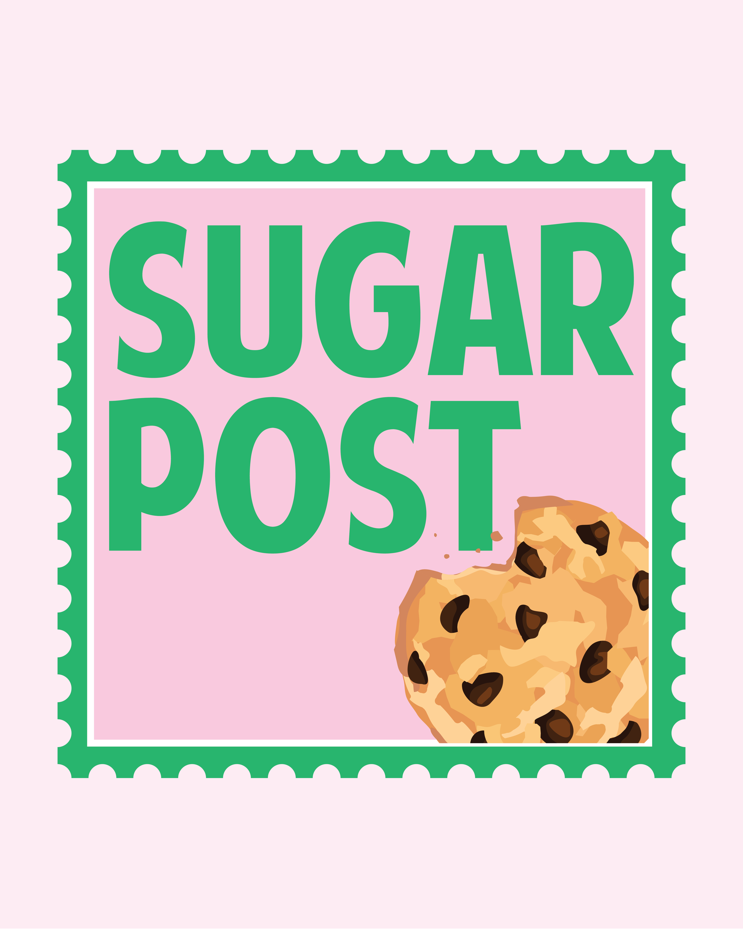
Stamp-Themed Packaging
Subscription boxes can be printed to look like oversized stamps, complete with perforated edges, cookie graphics, and playful color-blocking. Unboxing becomes a moment worth sharing.
Monthly Flavor Inserts
Each shipment includes a themed insert featuring:
the new monthly flavor
tasting notes
flavor inspiration
serving or pairing ideas
This element gives customers something to collect — and another way to connect with the brand.
Stickers & Labels
SugarPost’s illustration style lends itself beautifully to:
“Freshly Posted” stickers
“Sweetness Delivered” labels
Cookie-stamp seals
Bright return-address–style branding elements
These small touchpoints add charm and reinforce the theme.
Digital Presence
The bright palette and postage shapes translate seamlessly into:
social graphics
website icons
highlight covers
app-style badges
The visuals are impactful at every size.

What This Concept Demonstrates
SugarPost is a perfect example of how a strong visual theme makes a brand instantly memorable. By leaning into the mail-and-postage concept, the brand becomes recognizable, fun, and emotionally resonant.
This concept shows how Palm Street Studio approaches branding through:
storytelling
illustration systems
color psychology
packaging-focused design
guest experience thinking
It also shows how a subscription brand can use cohesive visuals to create delight from the moment the box appears on someone’s doorstep.
Interested in Branding for Your Hospitality or Subscription-Based Business?
Palm Street Studio specializes in creating thoughtful, personality-driven brand identities for bakeries, cafés, hospitality businesses, and subscription boxes. If you’re looking to bring more charm, cohesion, and customer delight to your brand, I’d love to help.