

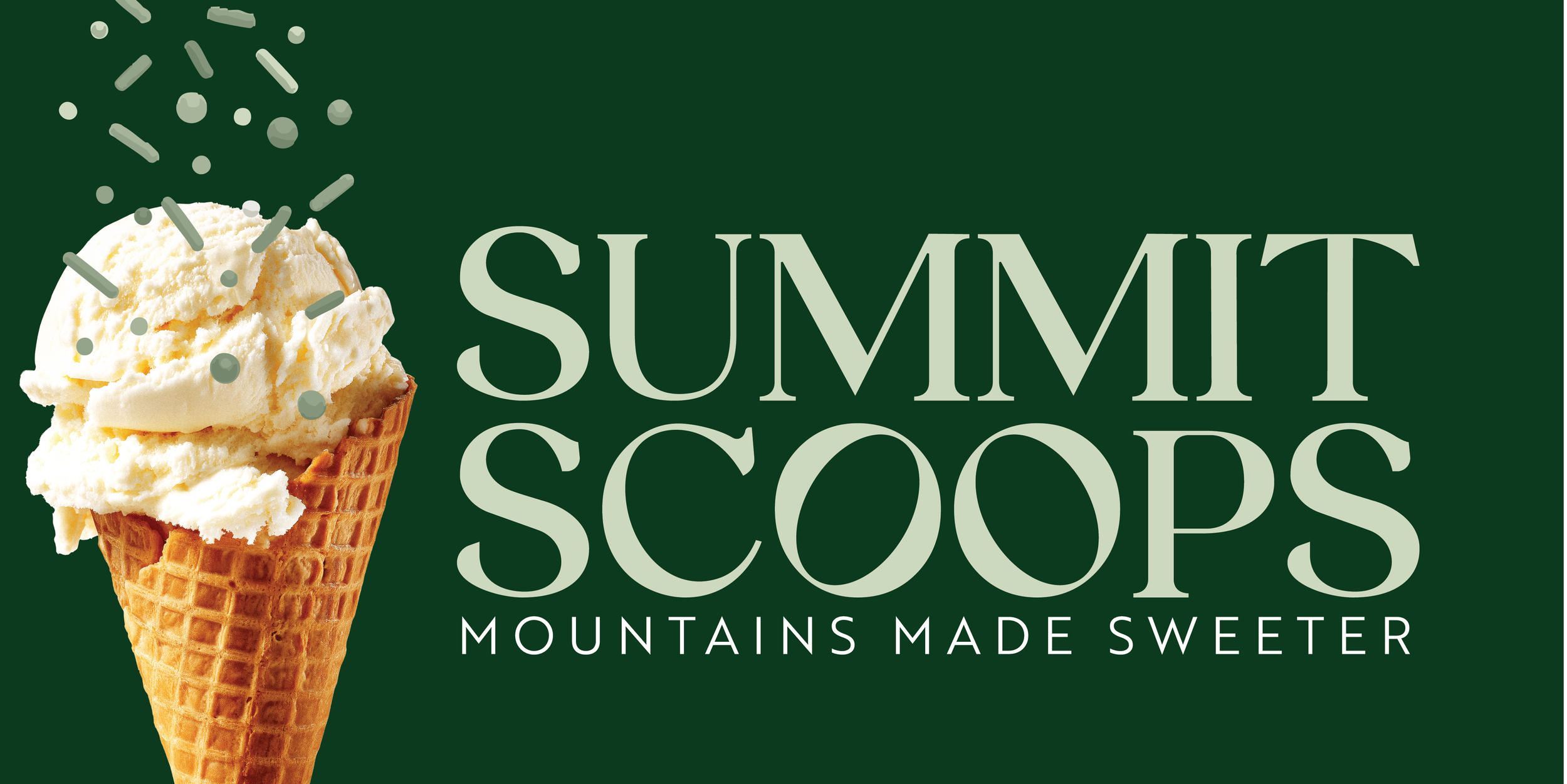
Summit Scoops — Brand Concept Spotlight
Mountains Made Sweeter.
Summit Scoops is a cozy, mountain-inspired ice cream brand created to show how place-based identity design can transform a simple treat into a full guest experience. This fictional concept imagines an ice cream shop tucked in the pines — part cabin, part vintage soda shop — where warm wood textures meet evergreen tones and every scoop is meant to be enjoyed after a long hike, a family trip, or a crisp mountain afternoon.
This project explores how thoughtful branding, intentional color palettes, and nostalgic details can help an ice cream shop feel at home far beyond the beach.
The Concept
Summit Scoops redefines the idea that ice cream is only for summer or seaside vacations. Instead, this brand imagines a destination ice cream shop nestled in the mountains — a place where families stop for a cone after exploring trails, visiting cabins, or spending weekends by the fire.
The tone is warm, rustic, and inviting:
think forest green, cream, and soft pine hues
wooden beams and vintage stools
cozy lodge-inspired textures
framed landscape art and antique touches
It’s the kind of shop where a scoop of ice cream feels like part of the mountain experience itself.
The Brand Direction
Color Palette
Rich, natural shades define this brand:
deep evergreen
soft pine green
warm stone neutrals
buttercream vanilla tones
These colors feel rooted in the landscape and help differentiate the shop from summer-only or beach-inspired ice cream branding.
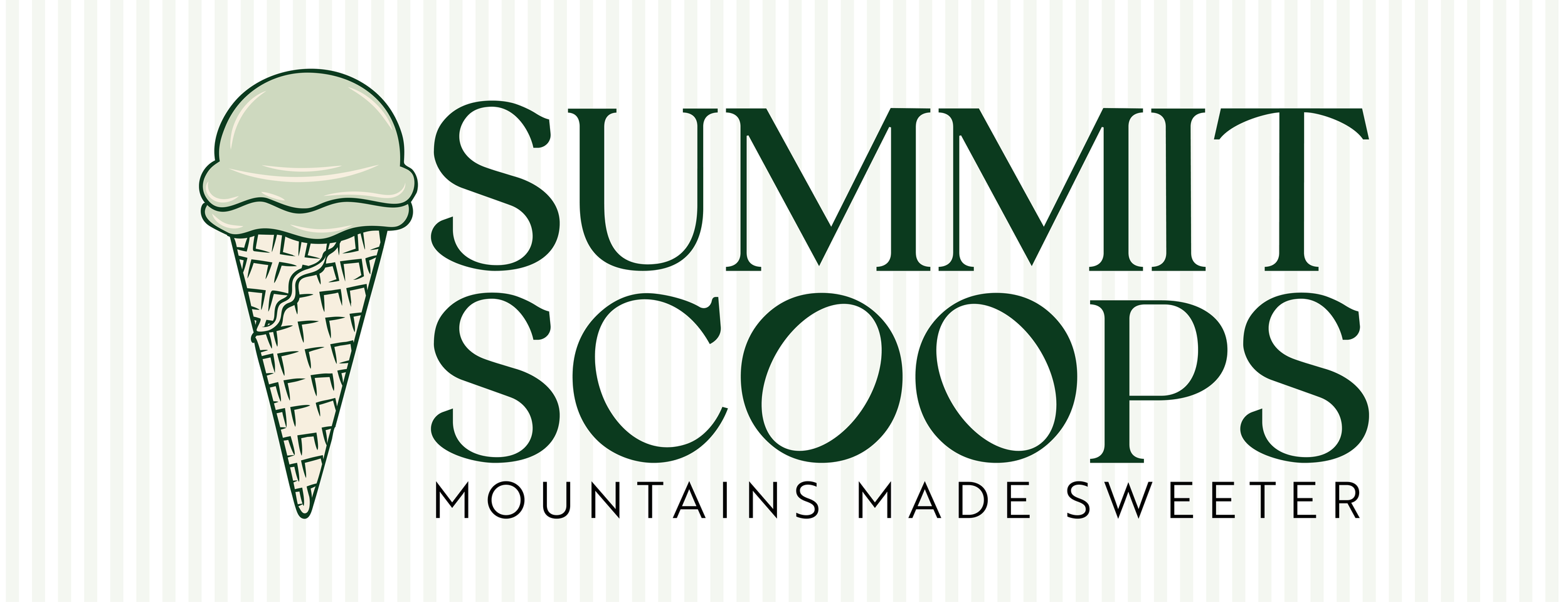
Typography
Summit Scoops uses a timeless serif with a touch of old-world elegance — strong, confident, and full of character. Paired with a classic ice cream cone illustration, the overall identity feels nostalgic yet elevated.
Illustration & Motifs
A hand-drawn ice cream cone icon
The large monogram “S” behind the emblem
Optional mountain silhouettes or ridge lines
Cone textures paired with cozy interior details
Everything works together to communicate the feeling of “heritage meets hometown.”


Brand Applications
Signage & Exterior
Imagine a dark green storefront against natural wood, a shingled roofline, cabin-style trim, and classic hand-painted signage. The shop feels timeless and built to last.
Menu Boards & Interior Touches
Vintage soda-shop stools paired with mountain-lodge textures:
warm wood
cream tile
brass accents
checkered flooring
gallery walls with mountain art or historic trails
Your mood board matches this aesthetic beautifully.
Merchandise & Packaging
Forest green pint containers
Branded ice cream tasting paddles
Warm-toned napkins and cups
Apparel in evergreen and cream
Custom enamel camp-style mugs
Guest Experience
Perfect for:
après-ski treats
family weekend trips
cozy fall and winter scoop moments
“mountain town must-visit” charm
This concept proves that an ice cream shop can thrive in every season.


What This Concept Demonstrates
Summit Scoops shows how branding can root a food or hospitality business in a sense of place. By drawing from the natural landscape, local textures, and timeless design elements, the brand feels grounded, memorable, and destination-worthy.
This concept also highlights Palm Street Studio’s ability to design:
place-inspired brand identities
hospitality branding with emotional pull
cohesive color palettes and interior-aligned branding
visual identities that extend seamlessly into product, packaging, and experiences
Interested in Hospitality Branding?
Palm Street Studio specializes in brand design for cafés, bakeries, boutique hotels, hospitality concepts, and place-driven food businesses. If you want a brand that feels rooted, nostalgic, and uniquely yours, I’d love to bring your vision to life.